
What would you like to see as the crest, and what colors? I'm curious to hear what people have to say
Team Crest
- Thread starter Shwafta
- Start date
You are using an out of date browser. It may not display this or other websites correctly.
You should upgrade or use an alternative browser.
You should upgrade or use an alternative browser.
New York has a red club and a blue club, so green or yellow? Green and yellow, like Norwich? Or could be a white primary, like Spurs or Swansea, with black or green or gold trim.
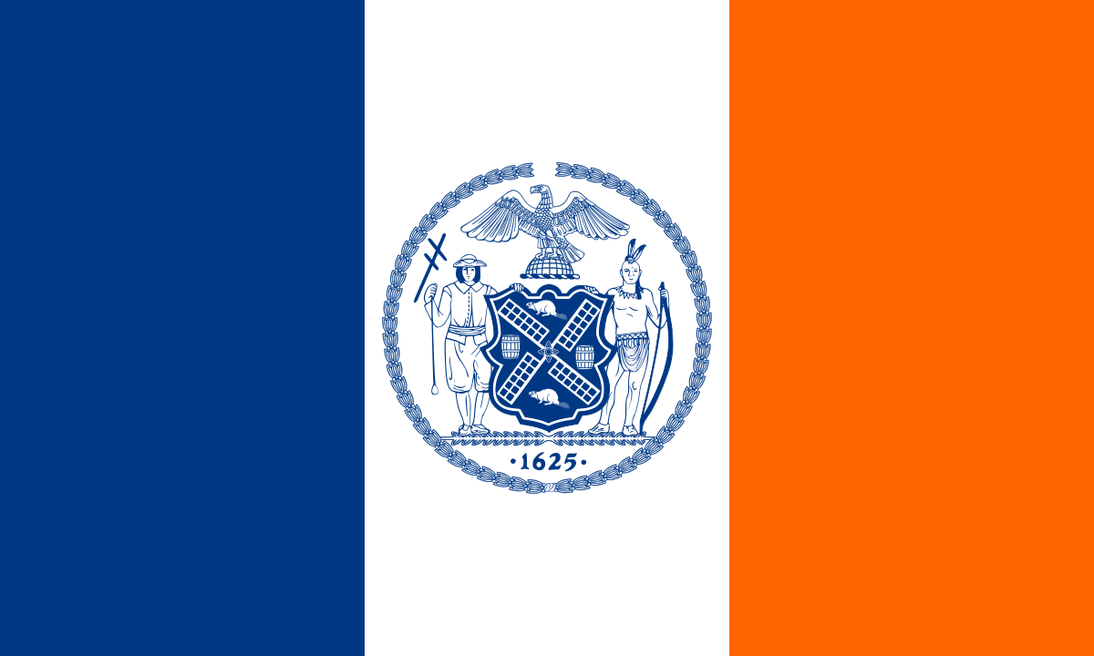
Flags of New York City - Wikipedia
I think they already have a team crest. I see it around town all the time, and they even already have it on t-shirts.What would you like to see as the crest, and what colors? I'm curious to hear what people have to say


I think I'm missing the joke on this.....I think they already have a team crest. I see it around town all the time, and they even already have it on t-shirts.
The Q doesn't touch Queens at all.
The joke applied until 2016 when the W came back.I think I'm missing the joke on this.....
The Q doesn't touch Queens at all.
I wrote this on Reddit:
Gold primary with blue and red as secondary colors used as minor accents. Blue and red are in the borough flag and the DV7 logo. These are also the three colors found in NYCFC, Spain, Barcelona, and Atletico Madrid. Gold as primary to represent the top of the DV7 pyramid.
Gold also stands out from the other three major soccer brands in the city.
They'd have to avoid a circle crest because then it starts to look like Real Madrid (circle with crown), but they could use the DV7 crest shape:

Put the Queens Crown from the flag on top, change the red to gold, and replace the stylized V7 with a Q or the red rose on the flag. Spitballin' here.
Gold primary with blue and red as secondary colors used as minor accents. Blue and red are in the borough flag and the DV7 logo. These are also the three colors found in NYCFC, Spain, Barcelona, and Atletico Madrid. Gold as primary to represent the top of the DV7 pyramid.
Gold also stands out from the other three major soccer brands in the city.
They'd have to avoid a circle crest because then it starts to look like Real Madrid (circle with crown), but they could use the DV7 crest shape:
Put the Queens Crown from the flag on top, change the red to gold, and replace the stylized V7 with a Q or the red rose on the flag. Spitballin' here.
watch it be sky blue ( queens flag) and people will freak out and say its a nycfc B team because of the that.
This amateur team had something interesting:

yeah I think it has to incorporate those elements and colors to match with the borough’s flag’s major symbols.
I’d go gold base with red and blue trim.
Can’t do green to avoid any affiliation with the Cosmos. But I do love the parks department leaf.
Which makes it even better.The joke applied until 2016 when the W came back.
- Excluding maybe colors, I doubt we see multiple elements from the county flag.
- I'll be very surprised if there is a crown. Nobody much cares about Queen Catherine of Braganza. It's not even clear the place was named after her. When some Portugese-Americans tried to erect a statue to her in Queens in the 1980s they raised the funds but abandoned the project in the face of opposition because they said she represented the slave trade, colonialism, and even Britain (apparently both some Irish and pro-1776 Americans were against it). In today's culture I don't see this team going there at all, especially with their diversity emphasis.
- Same for the tulips, roses and wampum. You can try to tell it as a nice story about different cultures coming together but few are interested in interpreting it that way and there will be opposition and push back.
- I'm tired of the 7 train as the symbol of Queens, but they might like it for a DV7 tie-in, and if they do plan eventually to build in Willets Point.
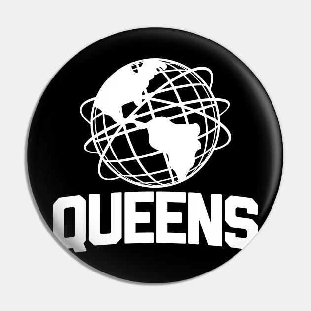
- I do like the Unisphere as a symbol of Queens. It also works well with the theme they are developing that Queens has people from more places speaking more languages than any other city/county. It might not be the primary crest element, but a globe is a likely element at least, perhaps a globe/soccer ball. There you have (1) Queens, (2) as microcosm of the world, (3) bringing people together through soccer. According to their video, that's what the team is all about.
Last edited:
The crest should have pigeons.
- Excluding maybe colors, I doubt we see multiple elements from the county flag.
- I'll be very surprised if there is a crown. Nobody much cares about Queen Catherine of Braganza. It's not even clear the place was named after her. When some Portugese-Americans tried to erect a statue to her in Queens in the 1980s they raised the funds but abandoned the project in the face of opposition because they said she represented the slave trade, colonialism, and even Britain (apparently both some Irish and pro-1776 Americans were against it). In today's culture I don't see this team going there at all, especially with their diversity emphasis.
- Same for the tulips, roses and wampum. You can try to tell it as a nice story about different cultures coming together but few are interested in interpreting it that way and there will be opposition and push back.
- I'm tired of the 7 train as the symbol of Queens, but they might like it for a DV7 tie-in, and if they do plan eventually to build in Willets Point.
- I do like the Unisphere as a symbol of Queens. It also works well with the theme they are developing that Queens has people from more places speaking more languages than any other city/county. It might not be the primary crest element, but a globe is a likely element at least, perhaps a globe/soccer ball. There you have (1) Queens, (2) as microcosm of the world, (3) bringing people together through soccer. According to their video, that's what the team is all about.

That's quite the interesting color scheme; can't wait to see how it looks on a kit!
Badge is mediocre. Not bad, but also not "wow" good
not bad, its different. I thought they were going to go with something related to the queens borough flag.
so now there are four pro teams in area ( assuming New Amsterdam and Cosmos play in city)
Most logo explainers are forced. This one is no different.
 www.queensborofc.com

The heart of a "Q" represents diversity?
A shield represents inclusion?
The edges of the shield specifically represent community?
These are beyond vapid.
The rest of it is fine, though again I note as a Queens resident of 20+ years that using a subway line to represent a borough that has terrible subway coverage is an odd choice. And picking the 7 train tells every neighborhood to the southeast of Woodside that their borough's most notable feature is a subway line that is irrelevant to them.
That said, I give the badge a tepid thumbs-up. I liked it better before I read the explainer.
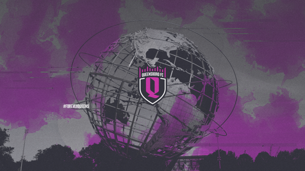
THE CROWNING OF QUEENS
QUEENSBORO FC REVEALS OFFICIAL CLUB LOGO FOR NYC’S FIRST EVER PROFESSIONAL SOCCER TEAM IN QUEENS, WITH INAUGURAL SEASON IN 2022
The heart of a "Q" represents diversity?
A shield represents inclusion?
The edges of the shield specifically represent community?
These are beyond vapid.
The rest of it is fine, though again I note as a Queens resident of 20+ years that using a subway line to represent a borough that has terrible subway coverage is an odd choice. And picking the 7 train tells every neighborhood to the southeast of Woodside that their borough's most notable feature is a subway line that is irrelevant to them.
That said, I give the badge a tepid thumbs-up. I liked it better before I read the explainer.
Last edited:
Agreed that the explainers are forced and its tiring.Most logo explainers are forced. This one is no different.
View attachment 10907THE CROWNING OF QUEENS
QUEENSBORO FC REVEALS OFFICIAL CLUB LOGO FOR NYC’S FIRST EVER PROFESSIONAL SOCCER TEAM IN QUEENS, WITH INAUGURAL SEASON IN 2022
The heart of a "Q" represents diversity?
A shield represents inclusion?
The edges of the shield specifically represent community?
These are beyond vapid.
The rest of it is fine, though again I note as a Queens resident of 20+ years that using a subway line to represent a borough that has terrible subway coverage is an odd choice. And picking the 7 train basically tells basically every neighborhood to the southwest of Woodside that their borough's most notable feature is a subway line that is irrelevant to them.
That said, I give the badge a tepid thumbs-up. I liked it better before I read the explainer.
And at the same time, I have to give credit to the people who come up with that shit. Like, how do you take the font of the letter and turn it into some "reason" (forced or not) on how it "represents" the local community and club?
Again, I want to be clear that I'd rather they not do this type of thing and it gets an eye-roll from me, but this is definitely not something that I could come up with, haha.
Agreed that the explainers are forced and its tiring.
And at the same time, I have to give credit to the people who come up with that shit. Like, how do you take the font of the letter and turn it into some "reason" (forced or not) on how it "represents" the local community and club?
Again, I want to be clear that I'd rather they not do this type of thing and it gets an eye-roll from me, but this is definitely not something that I could come up with, haha.
i havent checked but for the logo rebrands of other national teams and for example juventus, did they have diagrams explaining the changes? or is this a US only thing?
Similar threads
- Replies
- 88
- Views
- 2,740
- Replies
- 37
- Views
- 2,669